Community timeline explained
The community timeline shows how your Herdify areas are changing.
Visit the Audience Explorer in the Herdify portal to view the timeline.
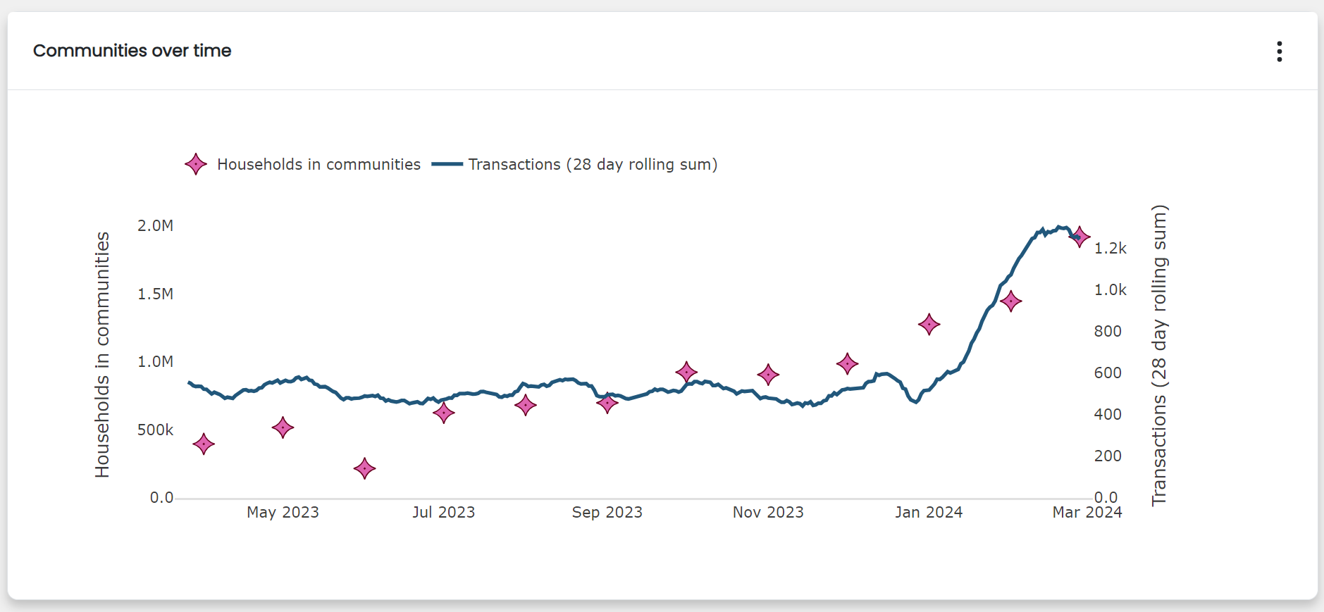
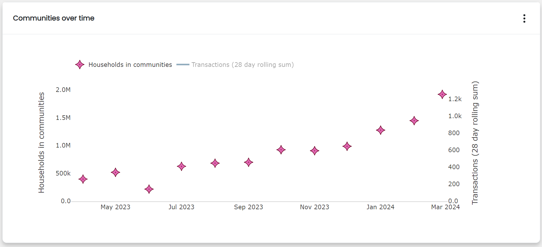
The community timeline tracks the number of households in Herdify areas each month.
The pink stars show the number of households in Herdify areas on a given date. You can view this value for days the Herdify model was run - or monthly, if you are a new Herdify customer. In practice this might mean that the stars are not equally distanced.
The blue line shows your brand's transactions over a 1 year period.
- Transactions are calculated over a 28 day rolling sum. This allows you to see trends in your transactions without daily noise.
- Hover over the line to view any 28-day period and the number of transactions that fell within these dates.
Click items in the legend to view each metric separately.